
Tips to Create Brand Icons that Stand Out
Do you want to design a truly unique and visually effective icons but don’t know where to start? Below are some easy recommendations that will help you with that.
Why are Icons Important?
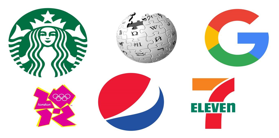
If you own a business, chances are you’ve already designed a great icon that helps represent your company or convey your overall brand philosophy. In everyday life, people interact with icons in many different ways and effectively utilize them for communication, visual guidance, and expressing emotions. While in-app emojis help make interpersonal communication more fun and engaging, such ubiquitous icons as wi-fi icon and airplane mode Icon remind you that your phone is connected to Wi-Fi or switched to airplane mode, respectively.
Icons are everywhere. They help spruce up your digital communication, navigate through different websites, boost the usability of online resources, improve design, and much more. With this in mind, you want to learn more useful tricks on how to design cool icons for your website, brand, or product.
Pay Attention to Form

Once you get down to designing your icon, pay special attention to how it’s made. In other words, you need to make sure its underlying structure is up to par. Not to reinvent the wheel and put together an attractive icon within the shortest time frame, you want to go with traditional geometric shapes. To achieve visual coherence, create a stable foundation for your icon using such shapes as a rectangle, triangle, square, or circle. As with any process, start simple and then gradually add elements and experiment with your primary shapes. You can also use a reliable icon maker to do this much faster. Remember to elaborate on detail and finesse your icon. But be sure not to go overboard. Otherwise, your icon might look cluttered and tasteless.
Make It Legible
Oftentimes, brands include text as part of their icon, and for good reason. This helps to give your icon additional visual depth and informativeness. And for this, any text you’re using with your icons needs to be legible, concise, and to the point. What’s more, the overall look of your icon and text needs to work well together and create a clear, memorable, and easy-to-read picture. If you’re designing a brand icon, consider using your signature fonts, calligraphy, and other elements your clients might associate with your brand.
Choose Images Wisely
One of the biggest mistakes that icon designers make is failing to use a truly meaningful and visually strong image. Just putting a random image in a frame doesn’t make for a good icon, of course. Once you select an image, make sure it fits in with other elements like your logomark, text representation, and the like.
What you want to strive for is visual weight, coherence, and effectiveness. So, when choosing an image, steer clear from cumbersome, difficult-to-figure-out, or low-resolution pictures. Ideally, you should discard photos and rely on vector graphics to put together a nice icon with a clear purpose.
Be Laconic
Sometimes, less is more. And nowhere does this principle work better than in icon design.
Needless to say, you might not have enough space to fit all preferred elements in one small icon. So, unless there’s a strong need to include the entire brand logo, consider discarding text altogether. The most compelling icons can do with just a couple of significant elements that represent your identity. For instance, you can pick one letter and combine it with your brand color. If need be, you can also complement the minimalist look of your icon with relevant type treatments.
Pick the Right Colors
If you want your icon to stand out from others of its ilk, experiment with colors. Ideally, you should pick the color that will stand out against different backgrounds and instantly catch viewers’ eyes.
If you want to use your brand colors but doubt that they will help your icon to stand out, consider mixing saturations and playing with tertiary colors. Also, try combining your primary colors with more vivid and bright colors. This will help enhance your icon effectiveness and at the same time maintain your brand identity.
Go Monochrome
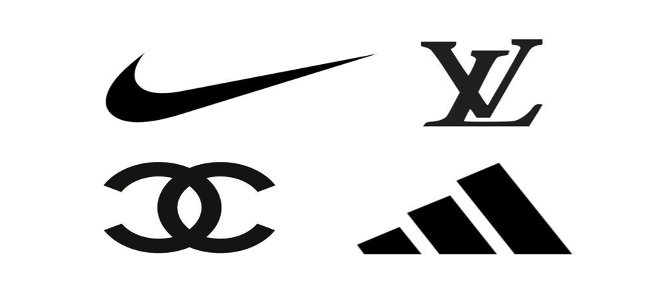
Monochrome design can be the best bet for small-scale icons whose visual message doesn’t change no matter the color. Black and white can be a go-to option when other ideas lack originality or simply don’t work. And the best thing is that you can always add necessary colors if you see that your monochrome design isn’t vivid enough.
Be Creative
Last but not least, as a designer of your unique icon, you shouldn’t be afraid to experiment with elements, shapes, and colors to breathe life into your design. Sift through different versions and sketches and add textures, shadows, and other effects until you’re fully satisfied with what you see.
Visit our site: News Infowars